
Conviction Wines
Telling the story of the Okanagan Valley with a sketchy and moody style.
Role
Illustrator
Character Designer
Agency
Brandever
Client
Andrew Peller Ltd.
Date
April 2015

Brandever wanted to bring the history of the Okanagan Valley into the Conviction labels. They had chosen three prominent men from the valley’s past to focus on but lacked direction for the visual style.
They brought the three character summaries to me with the request that an item pertaining to each character be made into a conceptual headpiece. Ultimately we decided on a loose and ethereal style that worked well with the pulp paper of the label.
The struggle with these illustrations was making the headpieces look conceptual as opposed to goofy or strange. With time and patience we achieved a broody balance of real elements with fantastical applications. Each piece is a combination of graphite drawings and digital painting. The characters themselves have exaggerated features and are heavily stylized.
The overall look is a bit gloomy to match the characters’ stories. Starting a winery wasn’t easy a century ago.


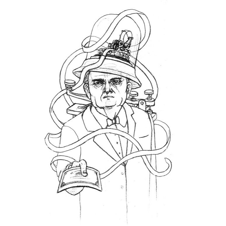
The Financier Brief
This character represents the fake telegrams that were given to the miners to get them to invest in the winery. It needed to incorporate the telegraph machine and a stock ticker machine, ideally with some wild, long strands of paper coming from it. The client especially liked the stock tickers that are contained in the glass bell jars and wanted the character holding a stock up with one hand. They provided useful reference photos that specified the era-specific items they desired me to replicate.
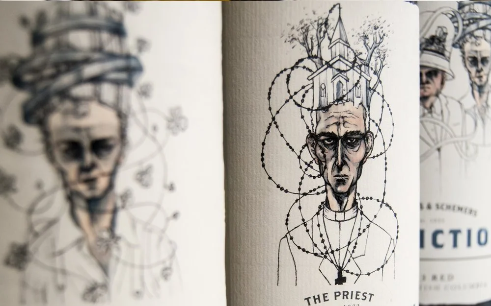

The Priest Brief
This character represents the catholic priest that convinced the church to buy the wine instead of importing it from Italy and in turn helped the winery become a success. A humble country church should sit atop his head with trees as a secondary element. Ideally other elements like a rosary or chalice or bible could be worked in.
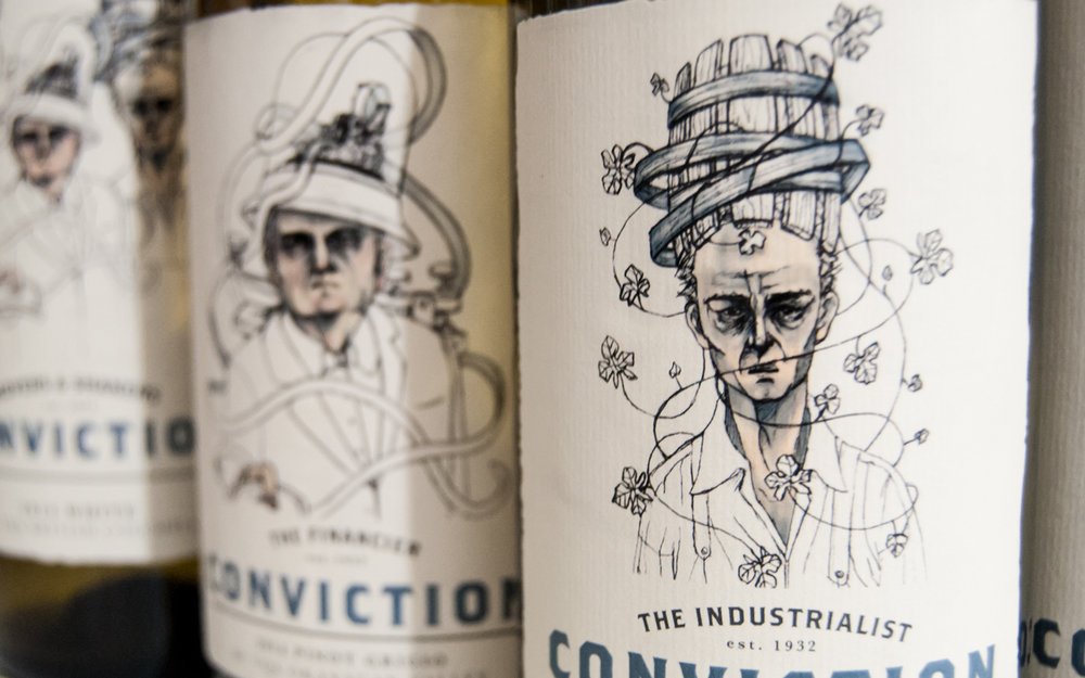
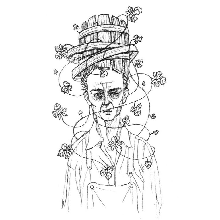
The Industrialist Brief
This character represents the entrepreneur who started the winery. It should have some sort of vat or barrel with grapevines but preferably no actual grapes. The client wanted to avoid tacky wine imagery as much as possible while still being true to the story so I avoided wine glasses and bottles to keep things more general.
To learn more about the history of Calona vineyards, check out this blog post from John Schreiner.
Learning Outcomes
Learning to find a good result with a client requirement is a core skill for any commercial illustrator. With Conviction Wines, I had to work colour into the illustrations in a way that I found pleasing even though I strongly preferred just a line art approach. Trusting the people that specialize in an industry like wine packaging is more important than personal artistic preference.