
Raven Conspiracy Wines
Striking raven illustrations that help the label stand out on the shelf.
Role
Illustrator
Agency
Brandever
Client
Andrew Peller Ltd.
Date
February 2015

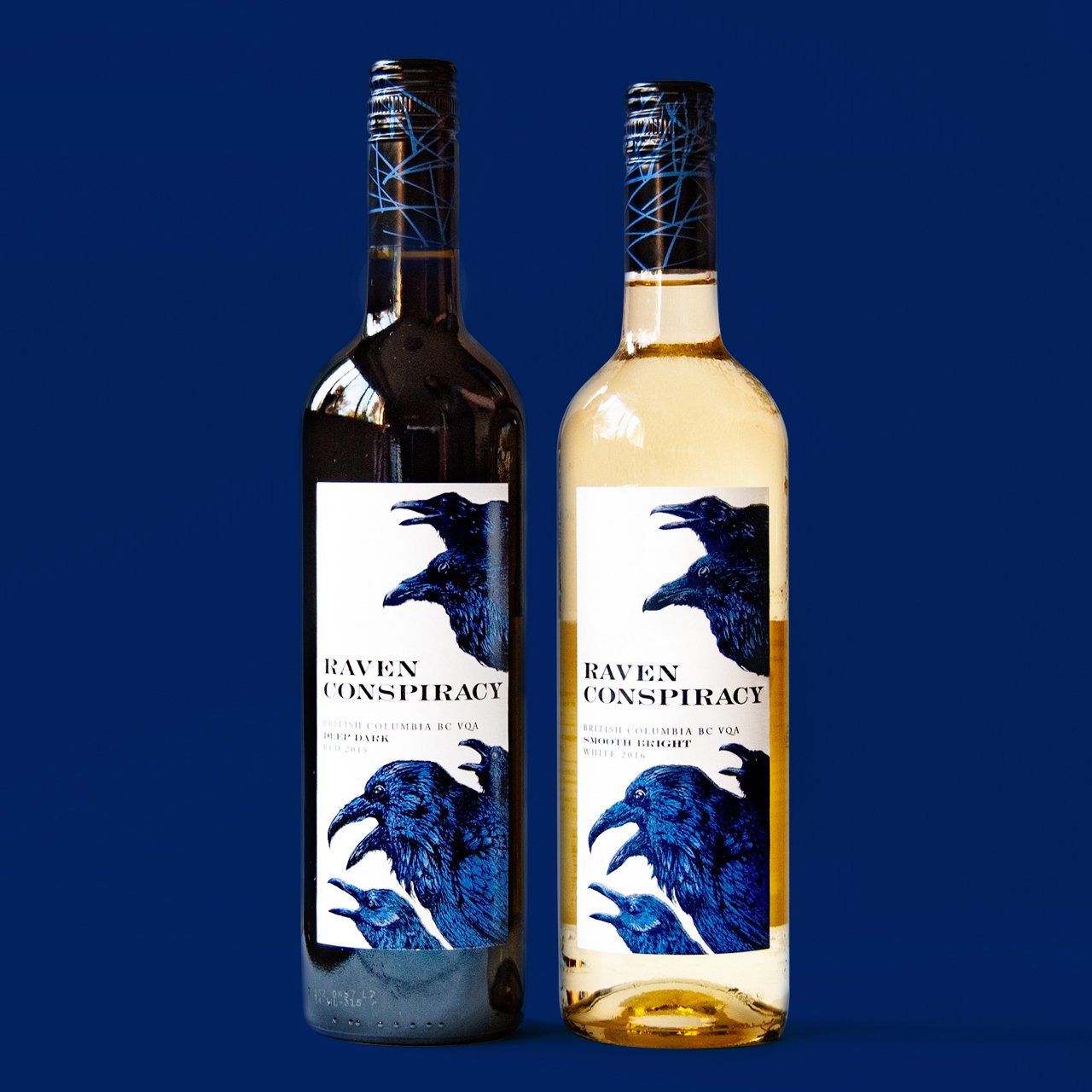
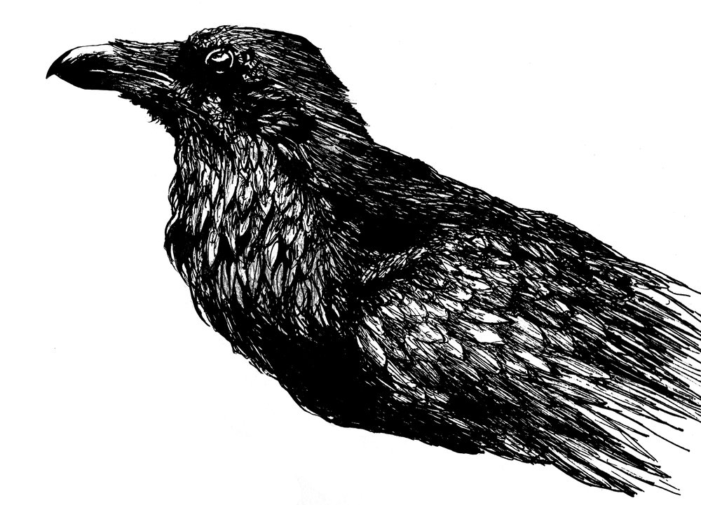
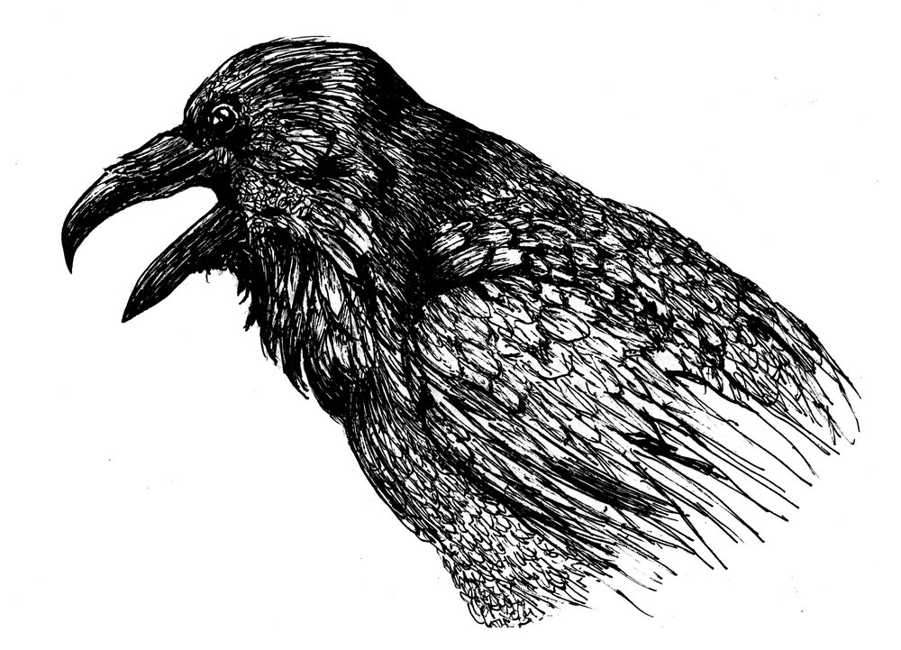
Knowing that the birds would be grouped together in the end, I created six separate ravens with enough wiggle room for Brandever to arrange them in any composition that worked with their design.
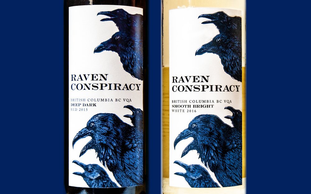
They created a beautifully printed and haunting group of birds that gives this wine bottle a striking appearance*. Brandever used the white areas of the illustrations to print a blue foil and emboss the feathers to give this bottle an Edgar Allan Poe look.
The drawings themselves were done using a fountain pen and ink except for two that used a brush to push them into the background more for depth. I focused on the detail of the feathers while keeping stylistically loose. This sketchy look allows for a more organic result for the blue foil.
*The Raven’s have since been laid out differently and on a grey background. I personally prefer the high contrast of the original but the client chose to move away from that.


Learning Outcomes
This was my first wine label illustration and it was incredibly fun. Having to consider how the designers will use them, getting to the bottom of the conceptual goal, and executing it in a style that meets the brief were all done with determination since i was determined to do well. I love art and I love wine and all I wanted from this project was to leave a good impression so I could do more labels. Now, in 2026 with seven eight labels in the world (though many under NDA), I would say mission accomplished.