
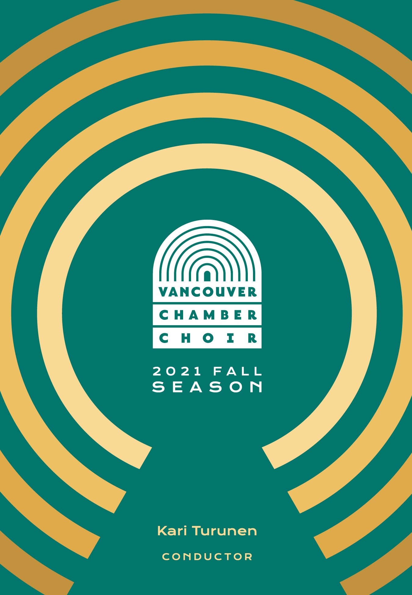
Vancouver Chamber Choir
The 2021/22 concert playbills for the choir needed a fresh new look that could carry over their two-part season cohesively.
Role
Visual Designer
Animator
Agency
OK Dave
Client
Vancouver Chamber Choir
Date
January 2021

The Vancouver Chamber Choir is a non-profit collective that works hard to deliver beautiful choral sounds every year. To help their music reach as many ears as possible, we created playbills and animated intros for digital recordings—A new endeavour so they could keep performing during the COVID years.
Each season needed to be distinct from the last with some element to ease them together. The previous look focused on a blue background with swathes of orange graphics to communicate the concert themes. The 2021/22 fall season designs trade the fills for bold line work to form abstract shapes that convey the essence of each show. Our colour choice was driven by the biggest show in the season—the holiday show. A calming green paired with shades of gold brings a subtly festive vibe to the season.
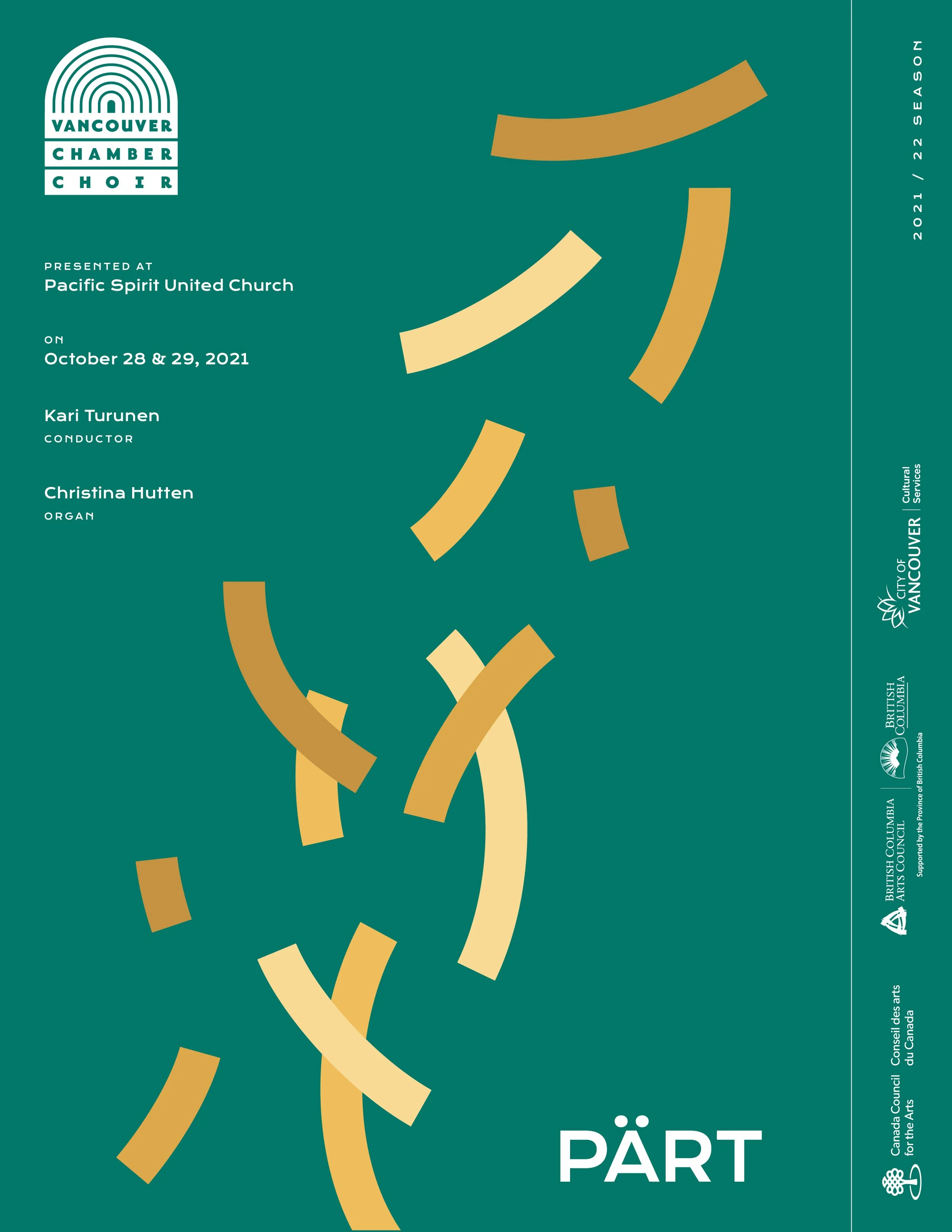
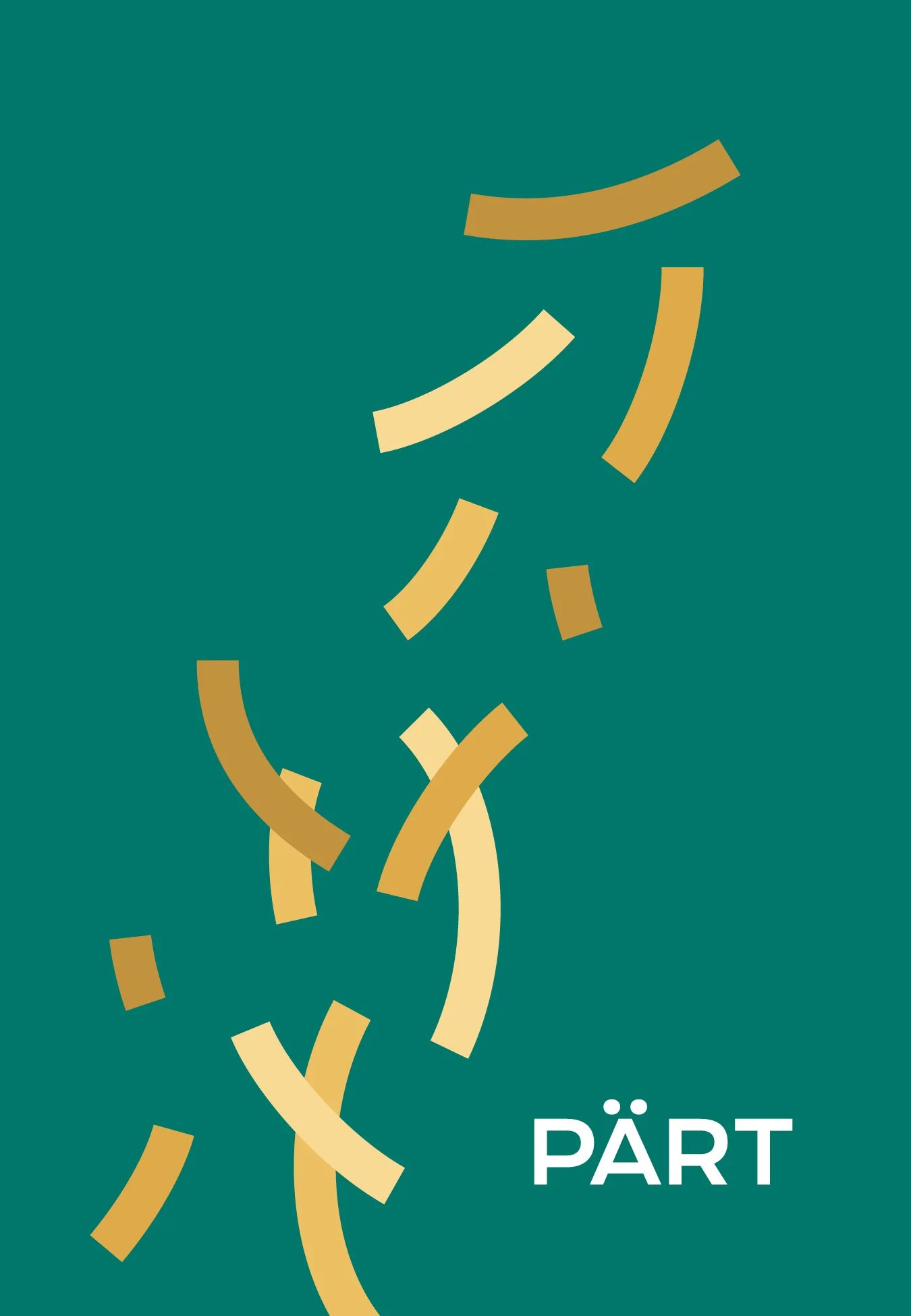
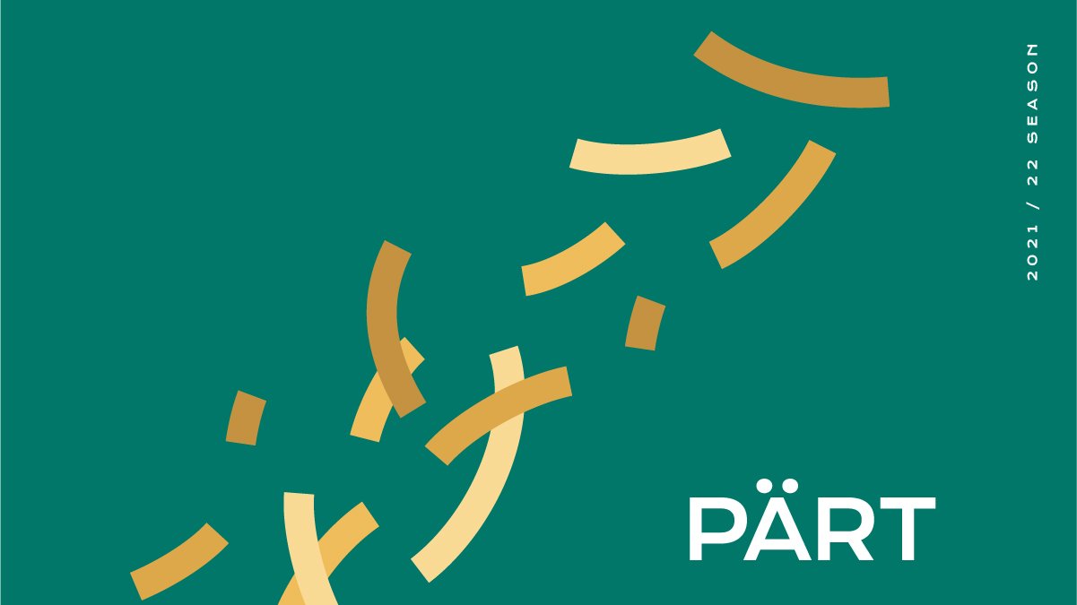
PärtComposer Arvo Pärt’s music is often minimal and broken into unexpected pieces. To show this, we broke the lines into wisps—A contrast to the symmetry of the other music and designs.
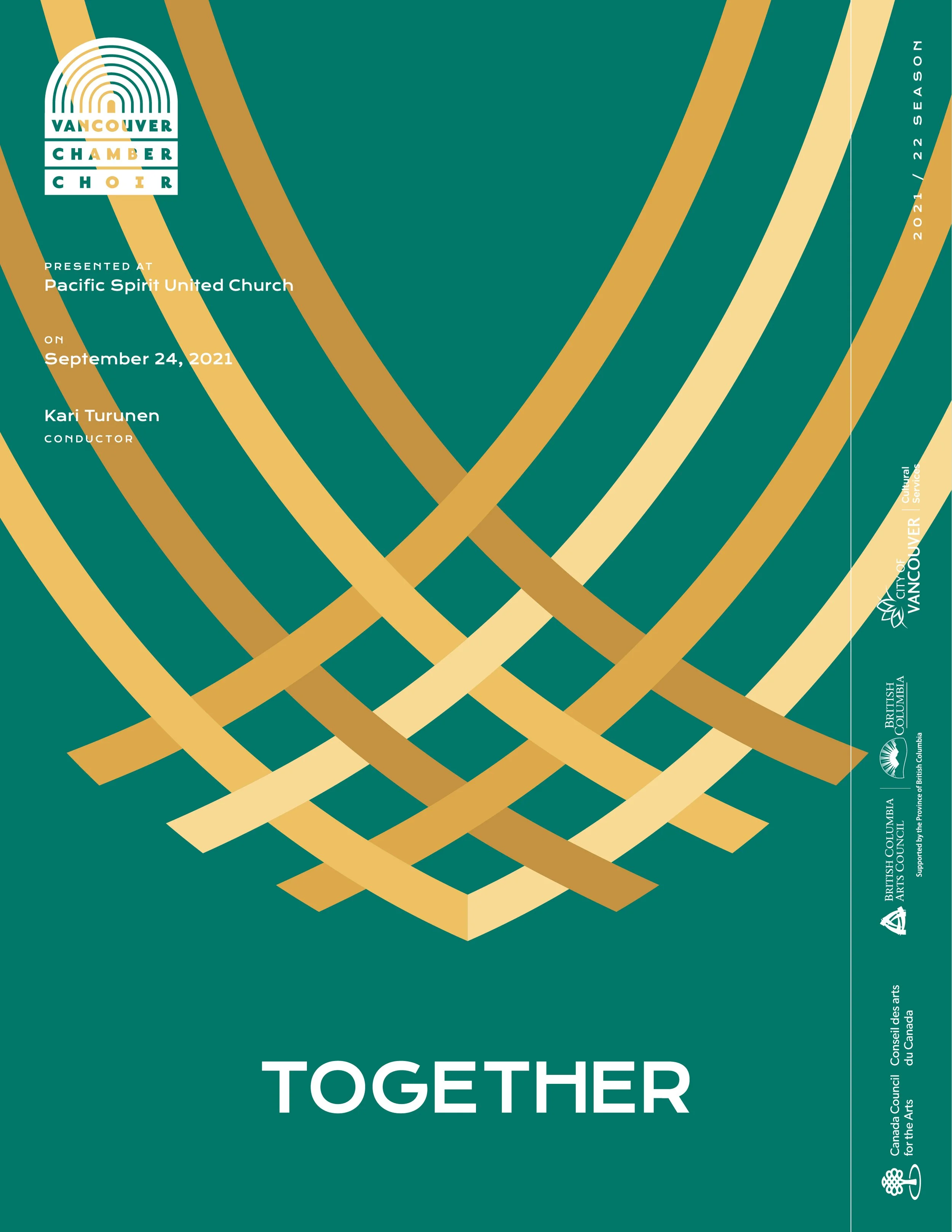
TogetherLines weave into the beginnings of a basket. A strand of straw isn’t much until you mesh it into something that can carry multitudes.
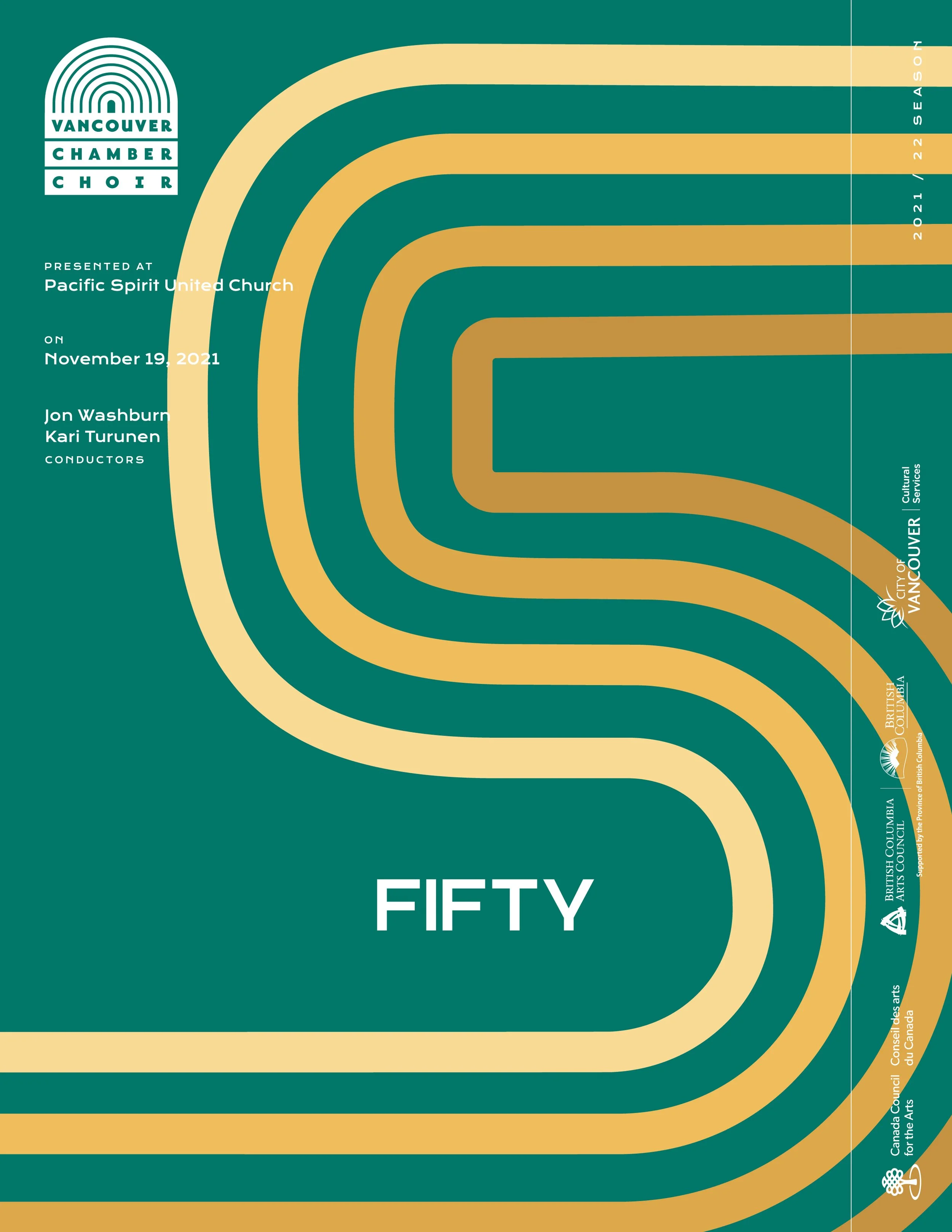
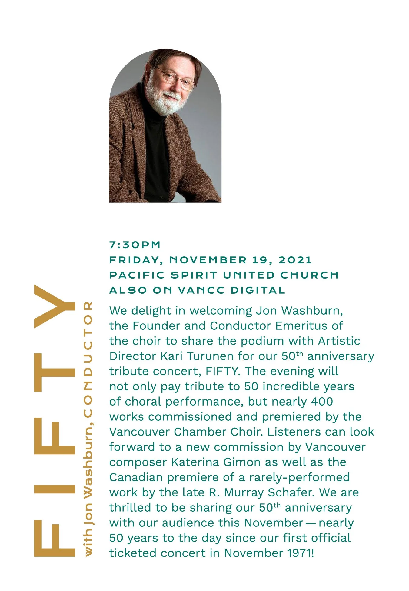
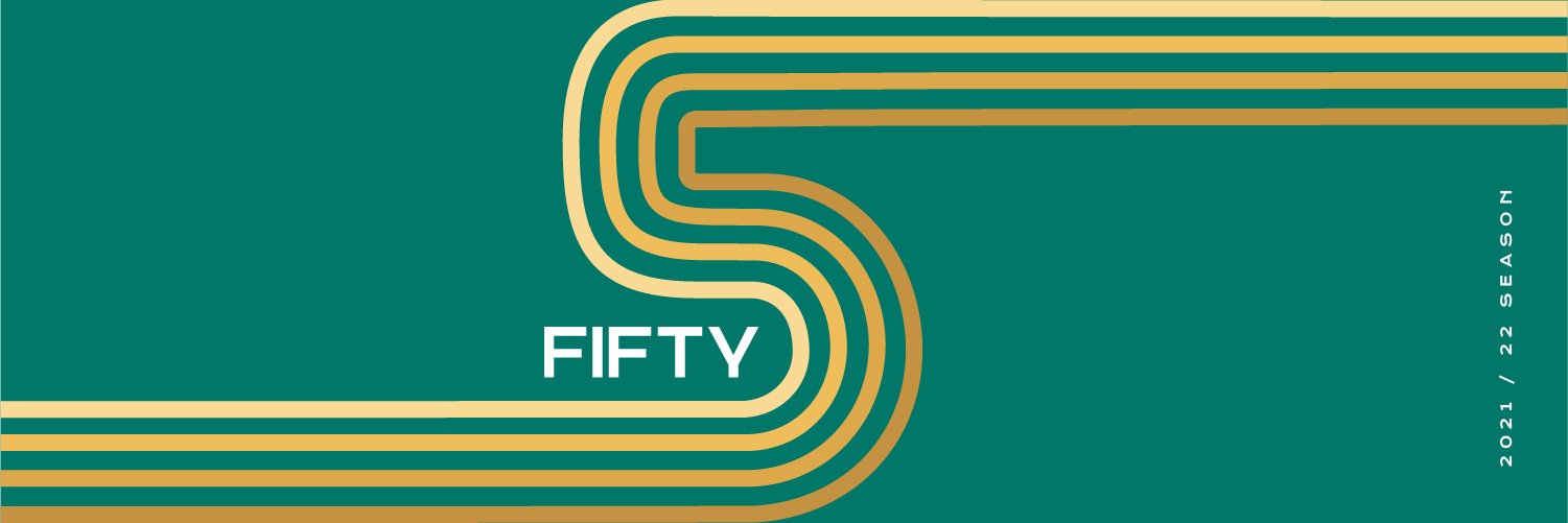
FiftyThis is a celebration of the choir’s fiftieth year of performing. A winding path in the loose shape of a five signifies the journey that they’ve been on.
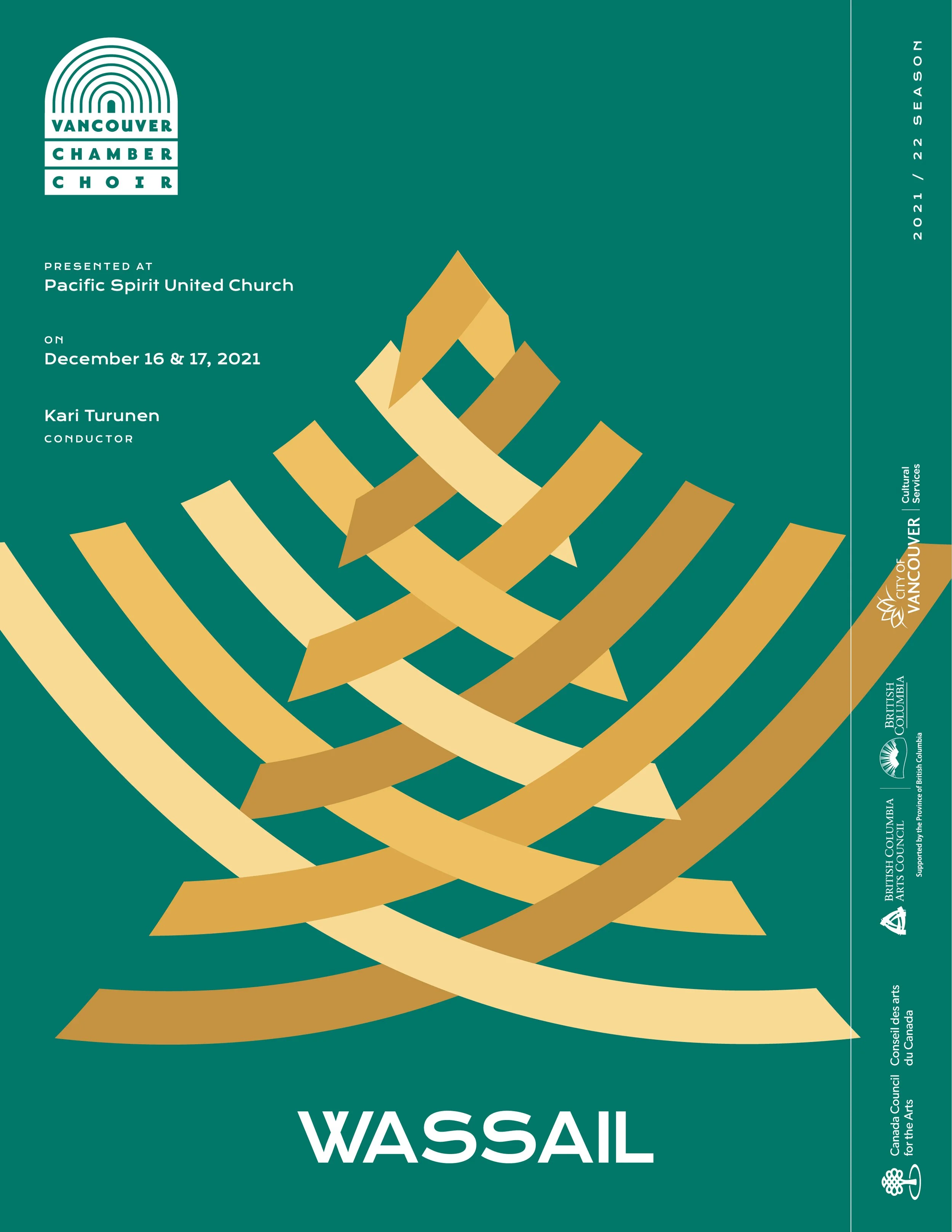
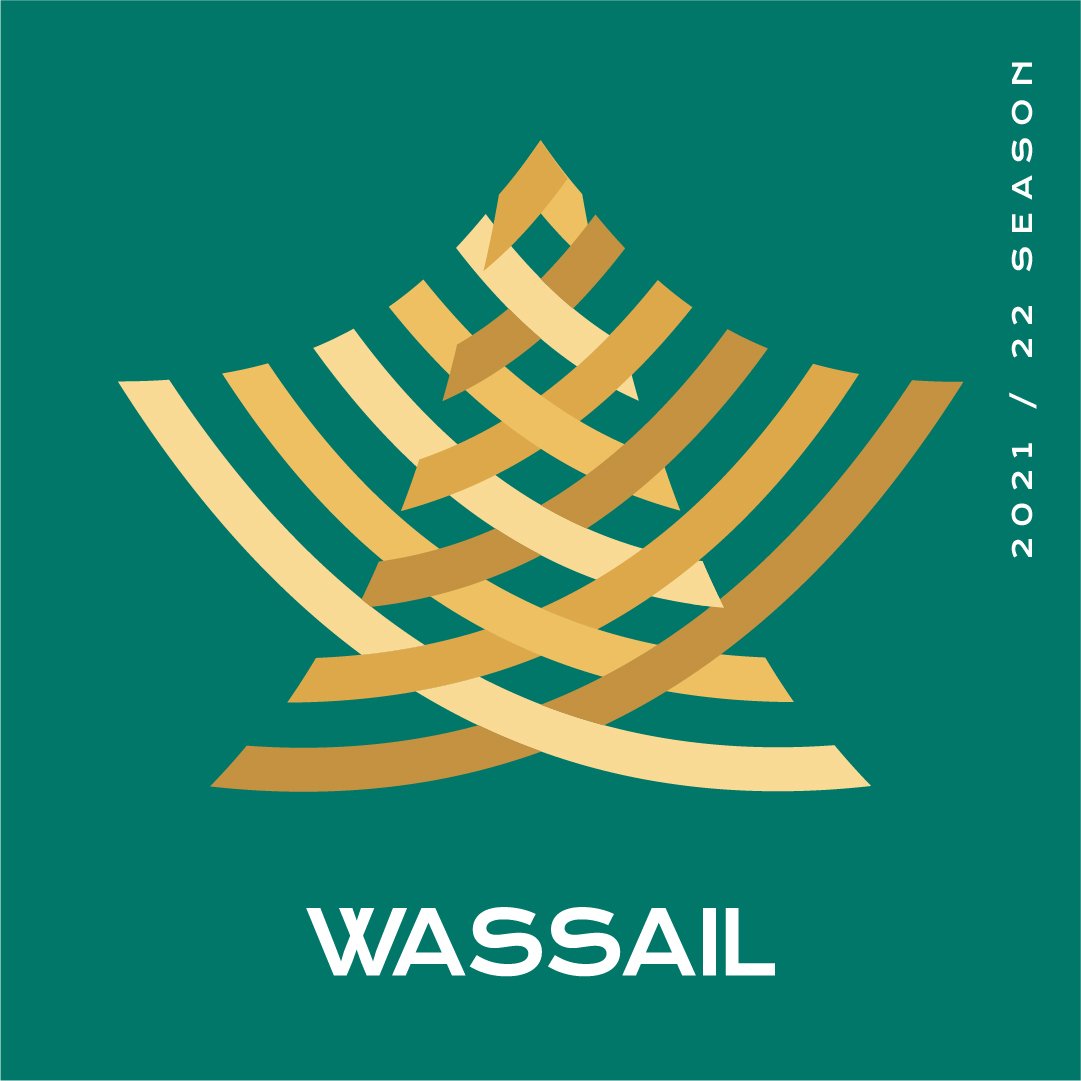
WassailThe climax of the season—The holiday show. While much of the music had religious content, the design should feel mostly non-sacred to avoid any offence. This resulted in a form that can be seen as a star, angel or, more abstractly, a tree or a bell.
On top of the playbills and animated intros, we made a brochure for each season. These gave listeners context for each piece and provided them a way to subscribe using a detachable post card. These folded accordion style with the information about the concert on one side and the artwork for it on the other. This would allow people to see all the art on one side if they chose to hang it up. We were advised that their long time fans actually love keepsakes from the season and wanted to nurture that love. Unfortunately, I don’t have any of the physical copies.


Due to COVID-19 quarantine rules, many of the Fall 2021 concerts had to be filmed. While this experience can’t compare with the resonance of attending a chamber choir live, it was a far better alternative to stopping completely. To immerse the viewer more, we animated opens for each concert which allowed us to express the concepts in a new medium.


The Vancouver Chamber Choir is a non-profit collective that works hard to deliver beautiful choral sounds every year. To help their music reach as many ears as possible, we created a set of playbills and other materials to promote their annual seasons.

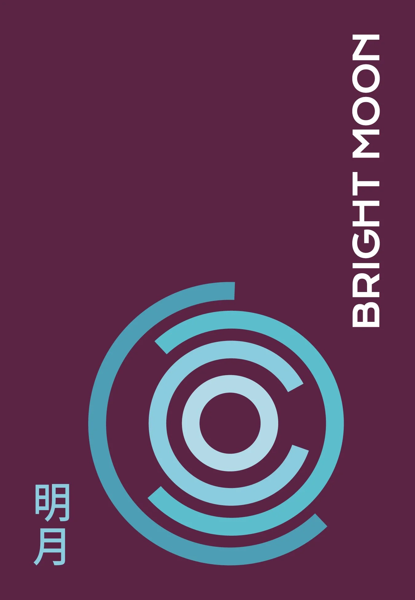
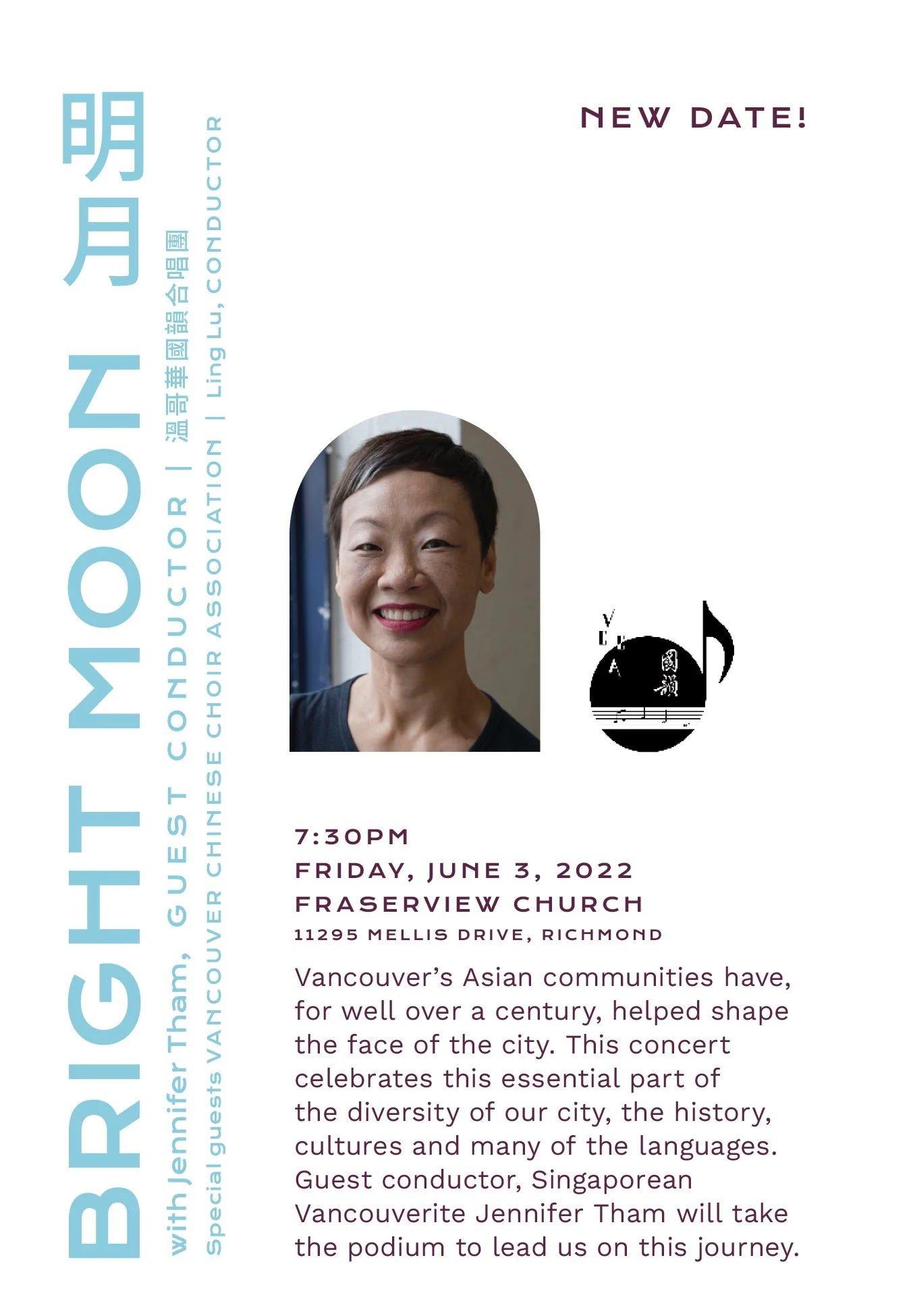
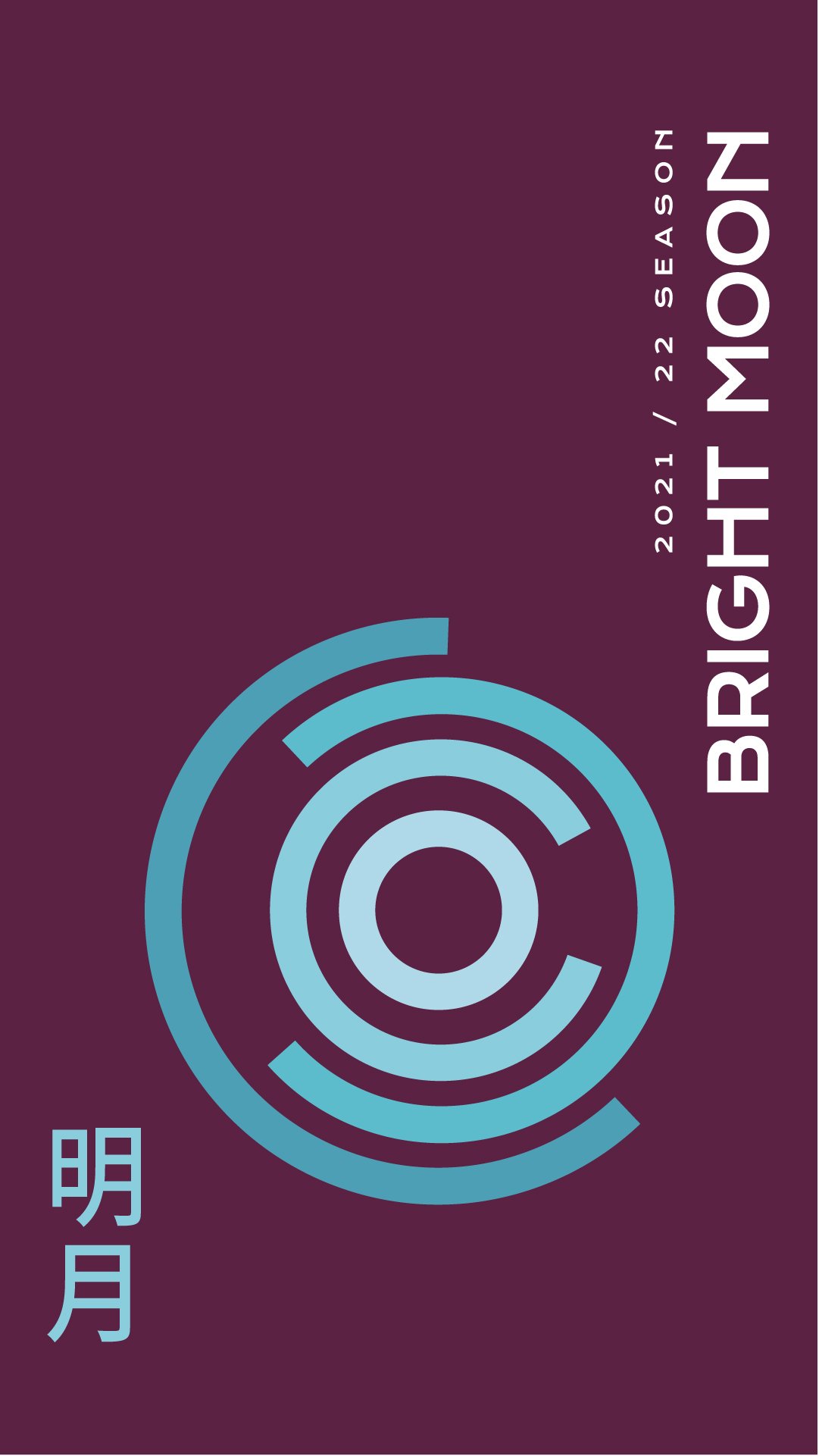
Bright MoonConductor Jennifer Tham and the Vancouver Chinese Choir Association celebrated the ways Chinese culture shaped Vancouver. The phases of the moon interlock to create pathways that shift and change with time.
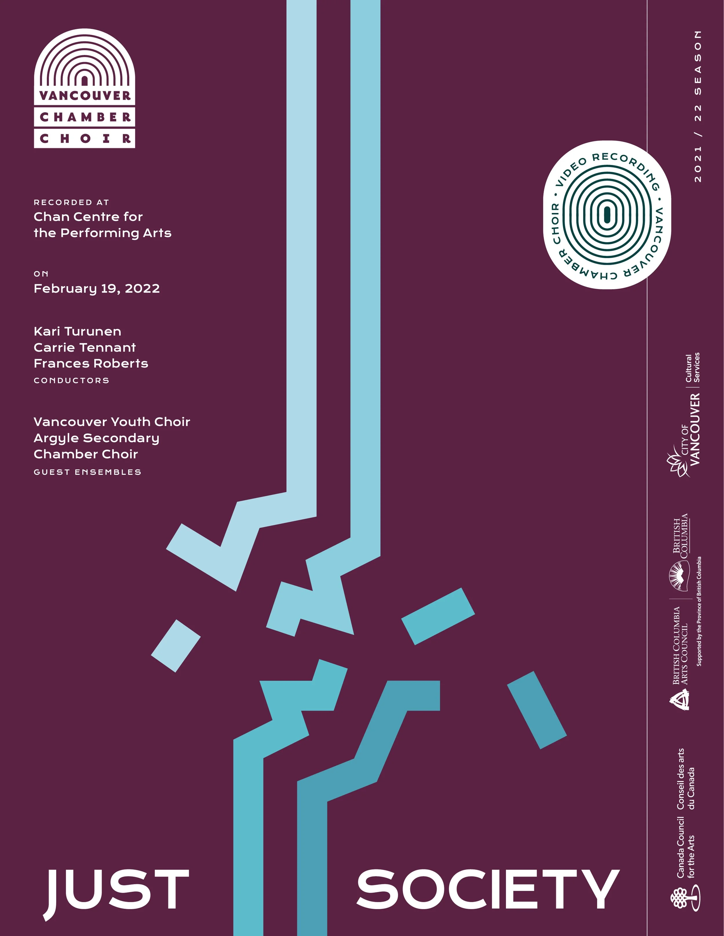
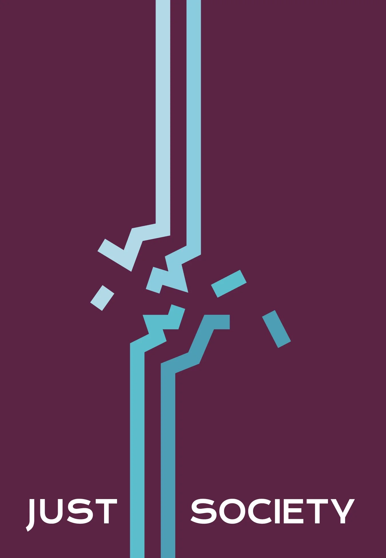
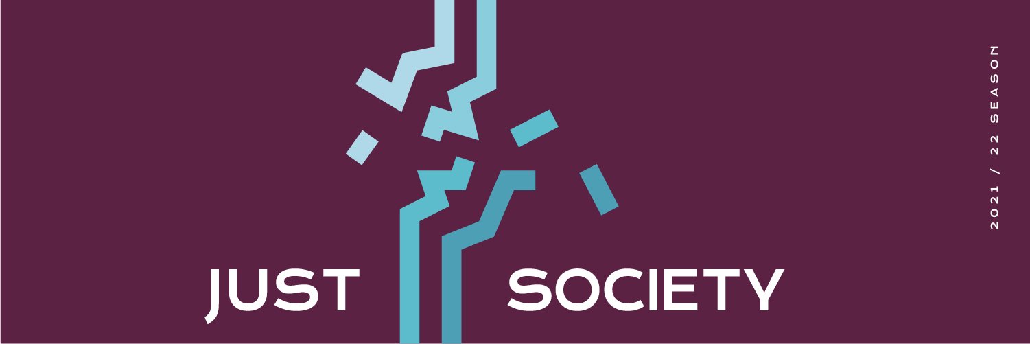
Just SocietyThe Vancouver Youth Choir sing about progressing culture and having hope for a brighter future despite the grim climate we live in today. The struggles of opposing generational and classist forces is the focus of this design with a clash under pressure.
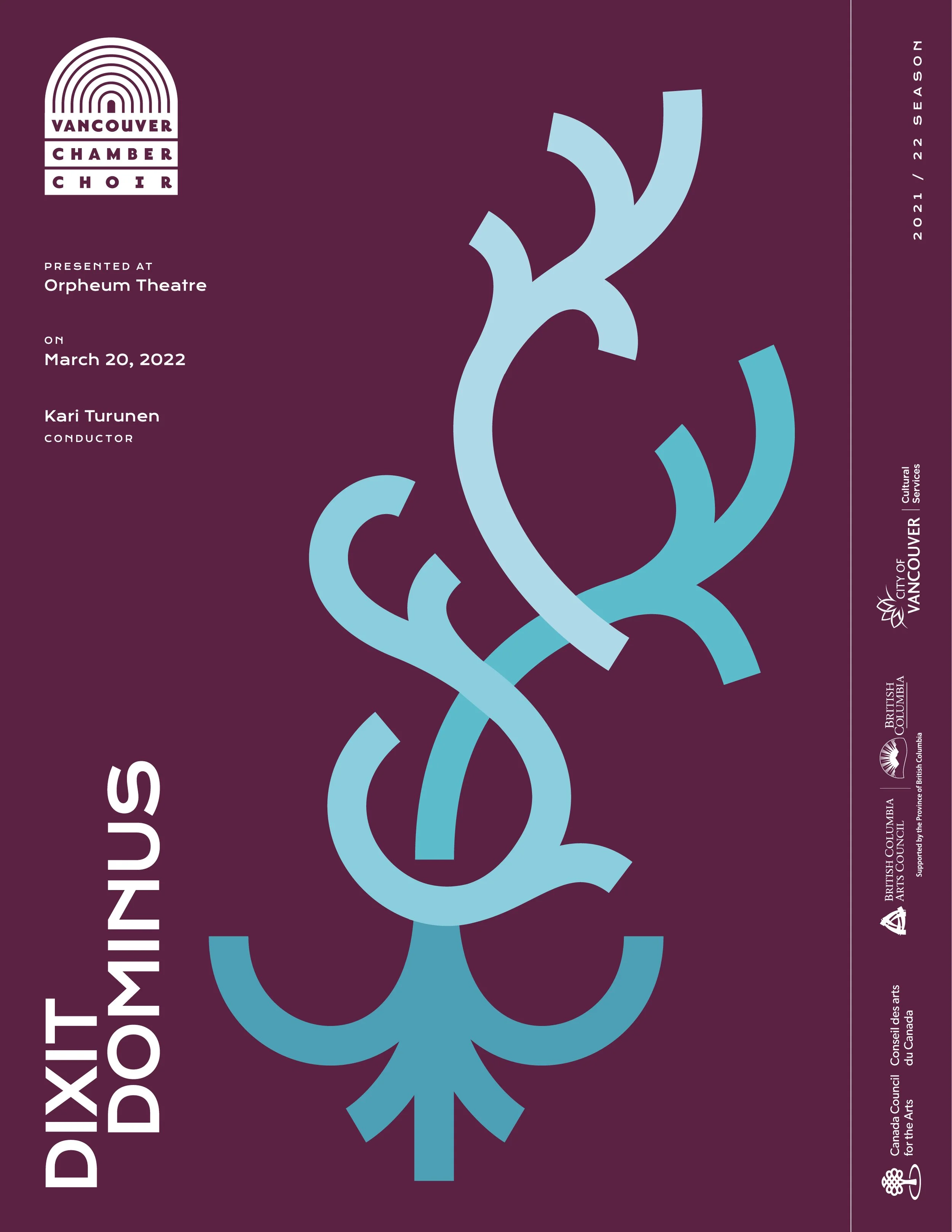
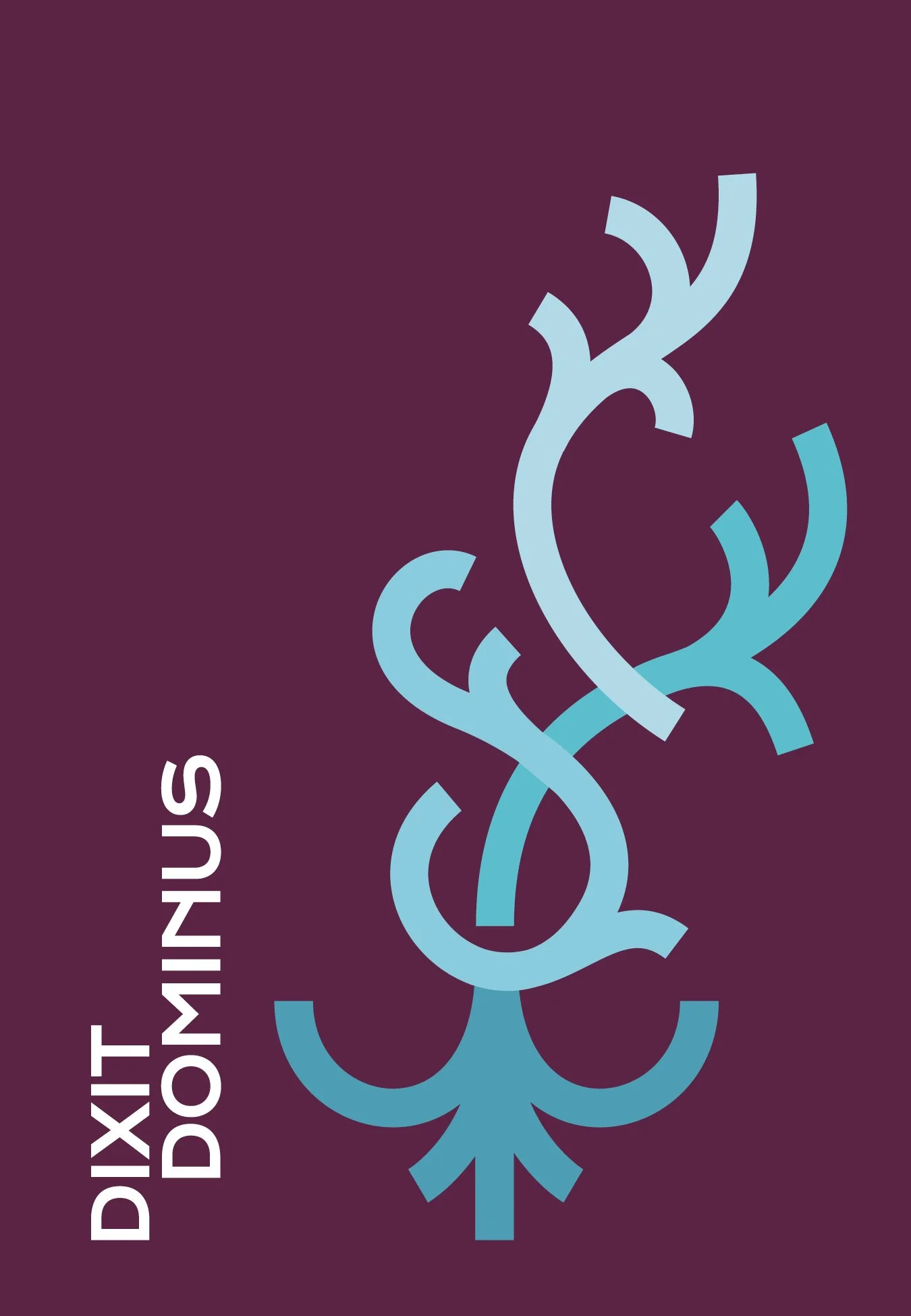
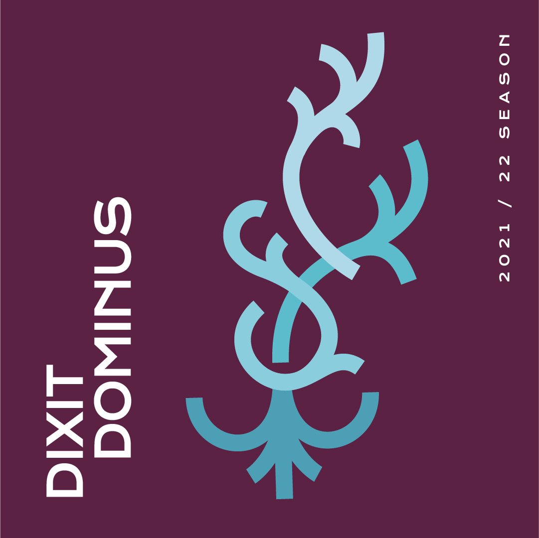
dixit dominusAn epic piece of music from Händel originally composed in 1707 is a dramatic piece. The elegant arcs of this design are reminiscent of bel composto and grow upward in a sweeping crescendo.
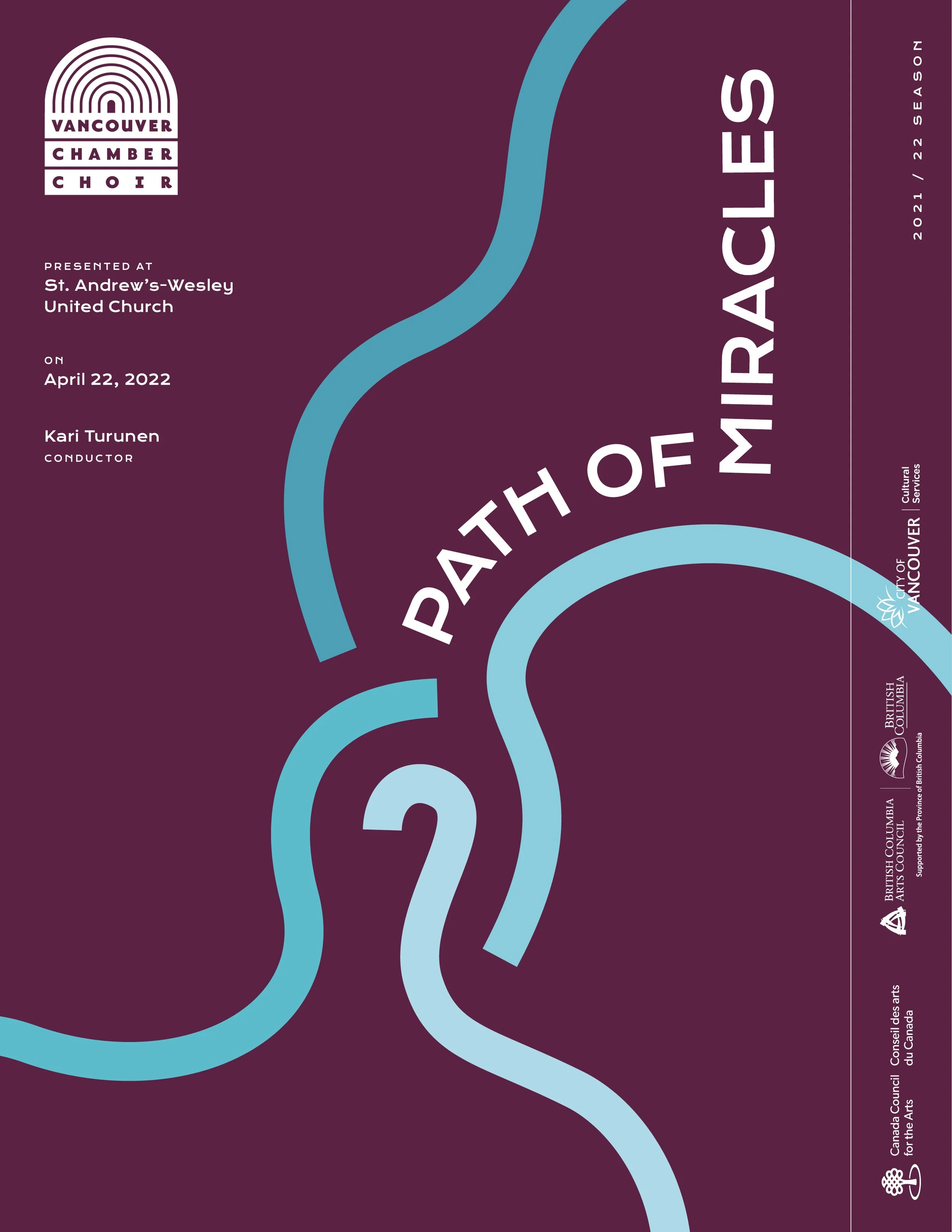
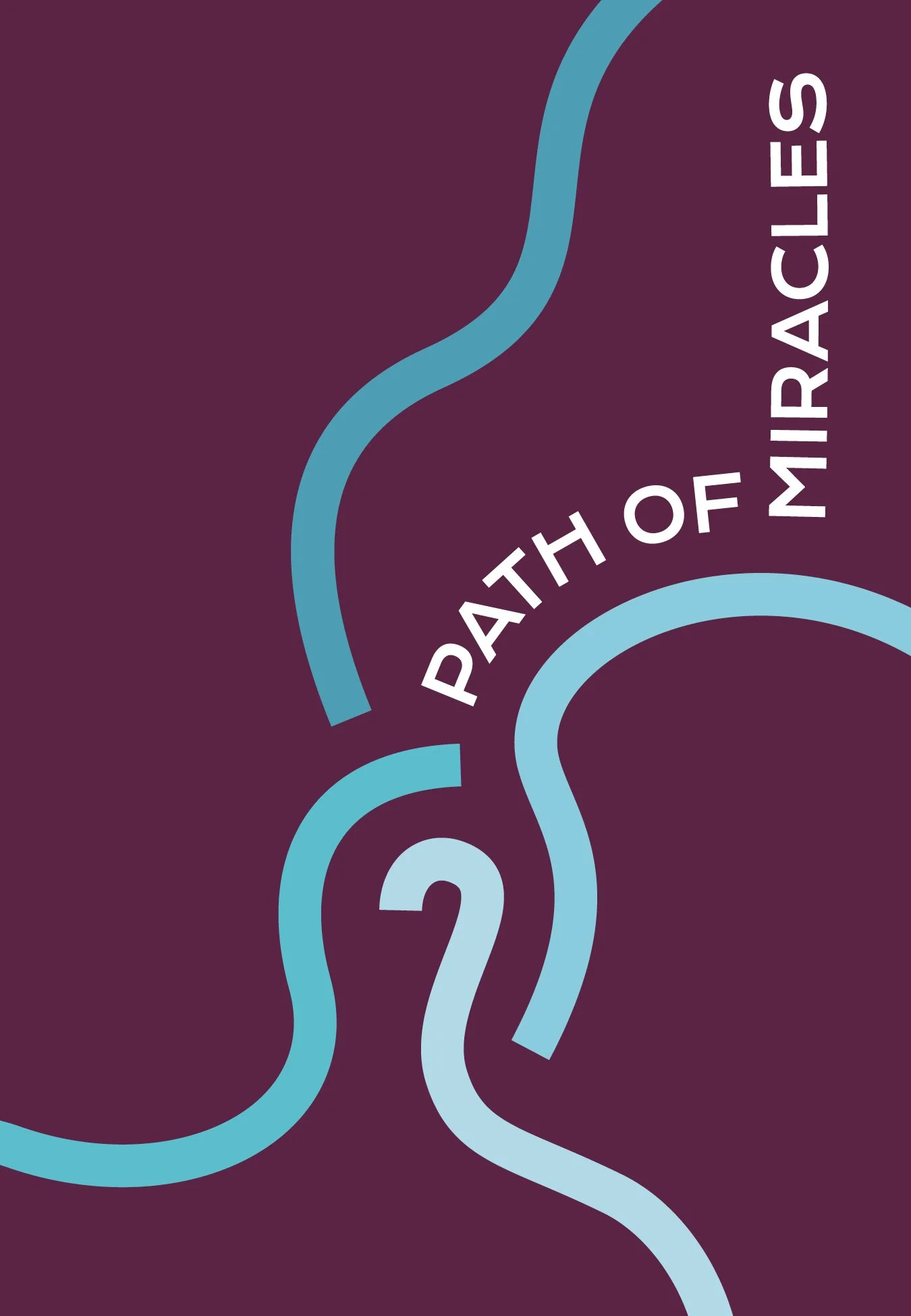
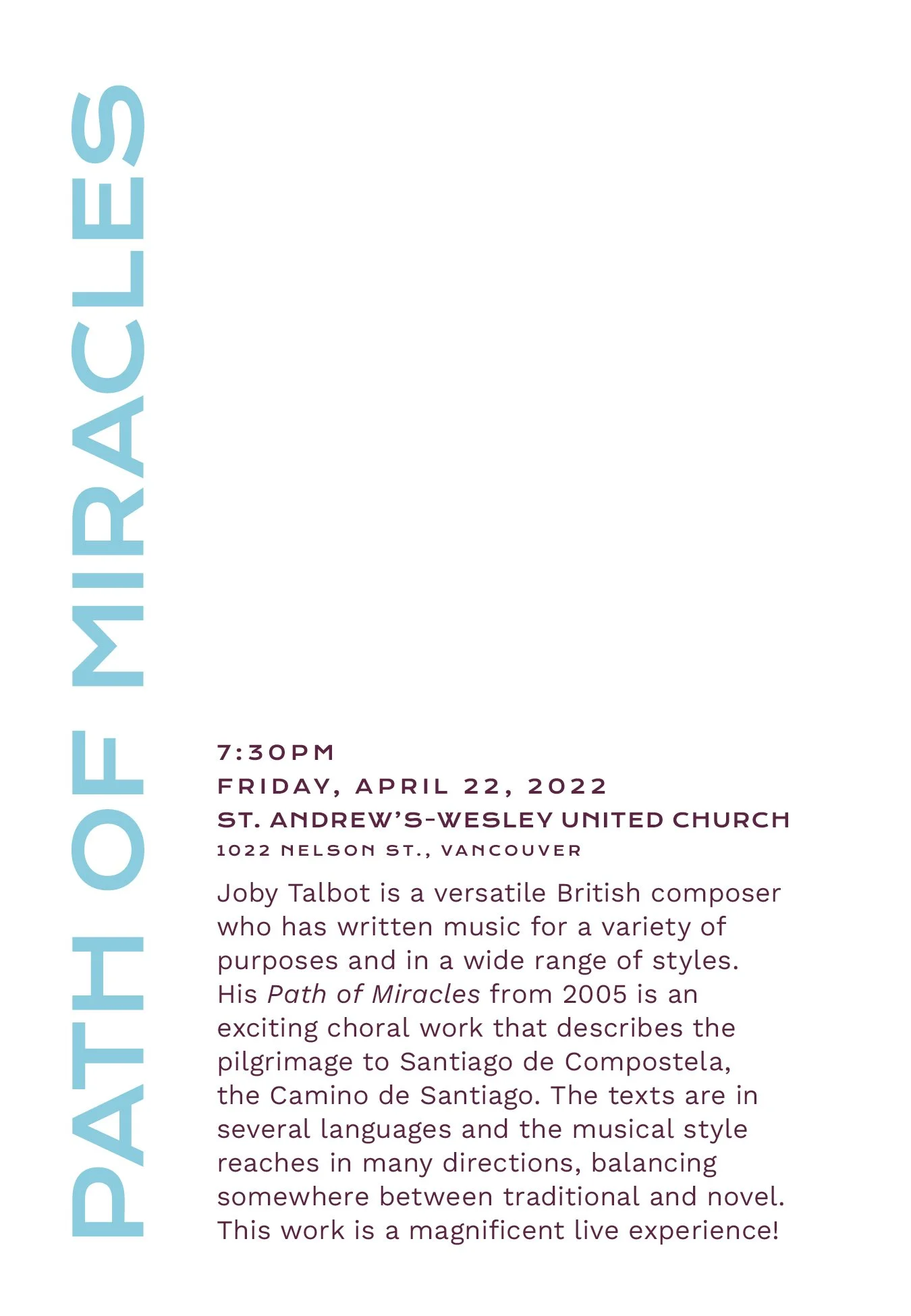
Path of MiraclesPath of Miracles is the story of the great pilgrimage Camino de Santiago in Spain. This pilgrimage has multiple routes that all lead to the shrine of St. James. We focused on that journey with tendrils reaching from many sides all uniting at their one goal.
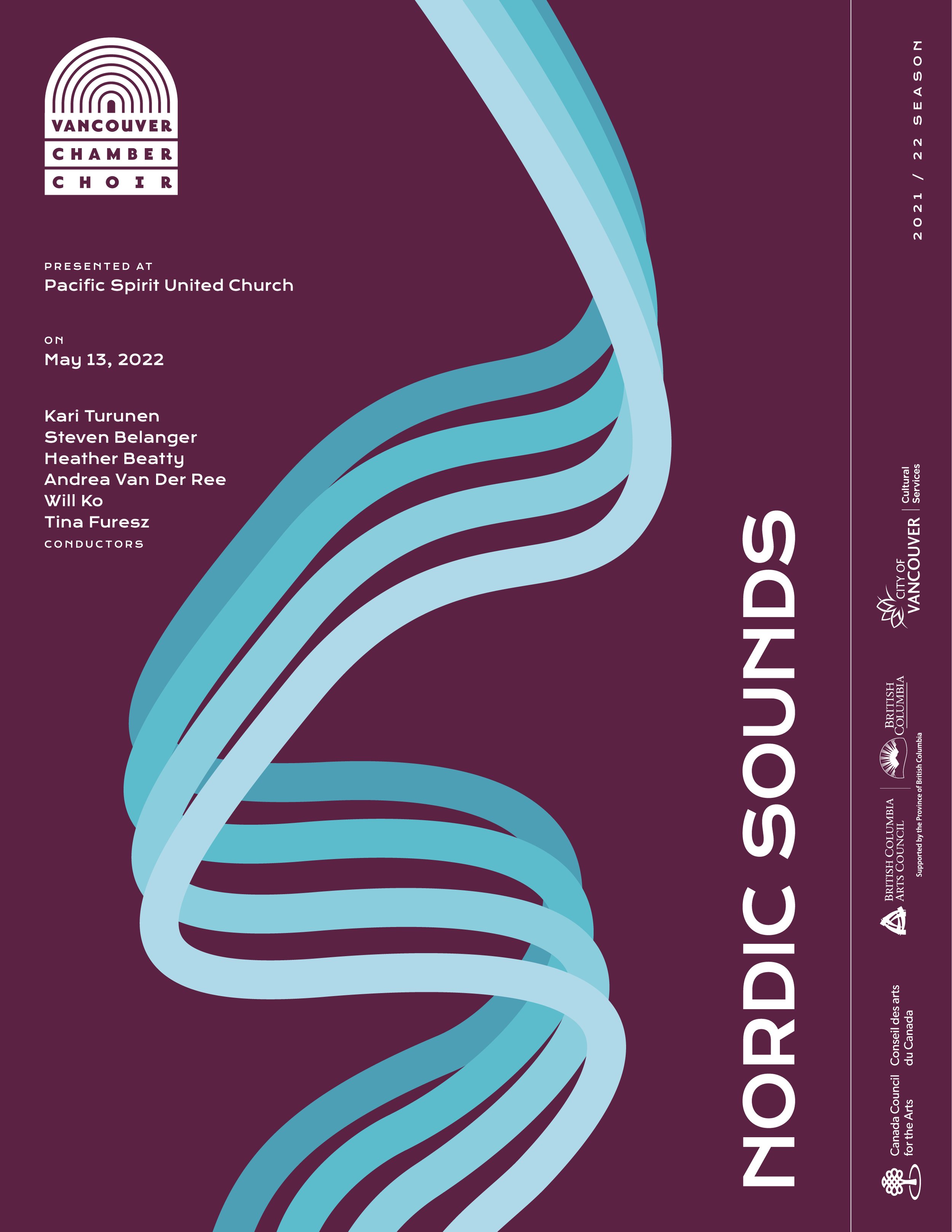
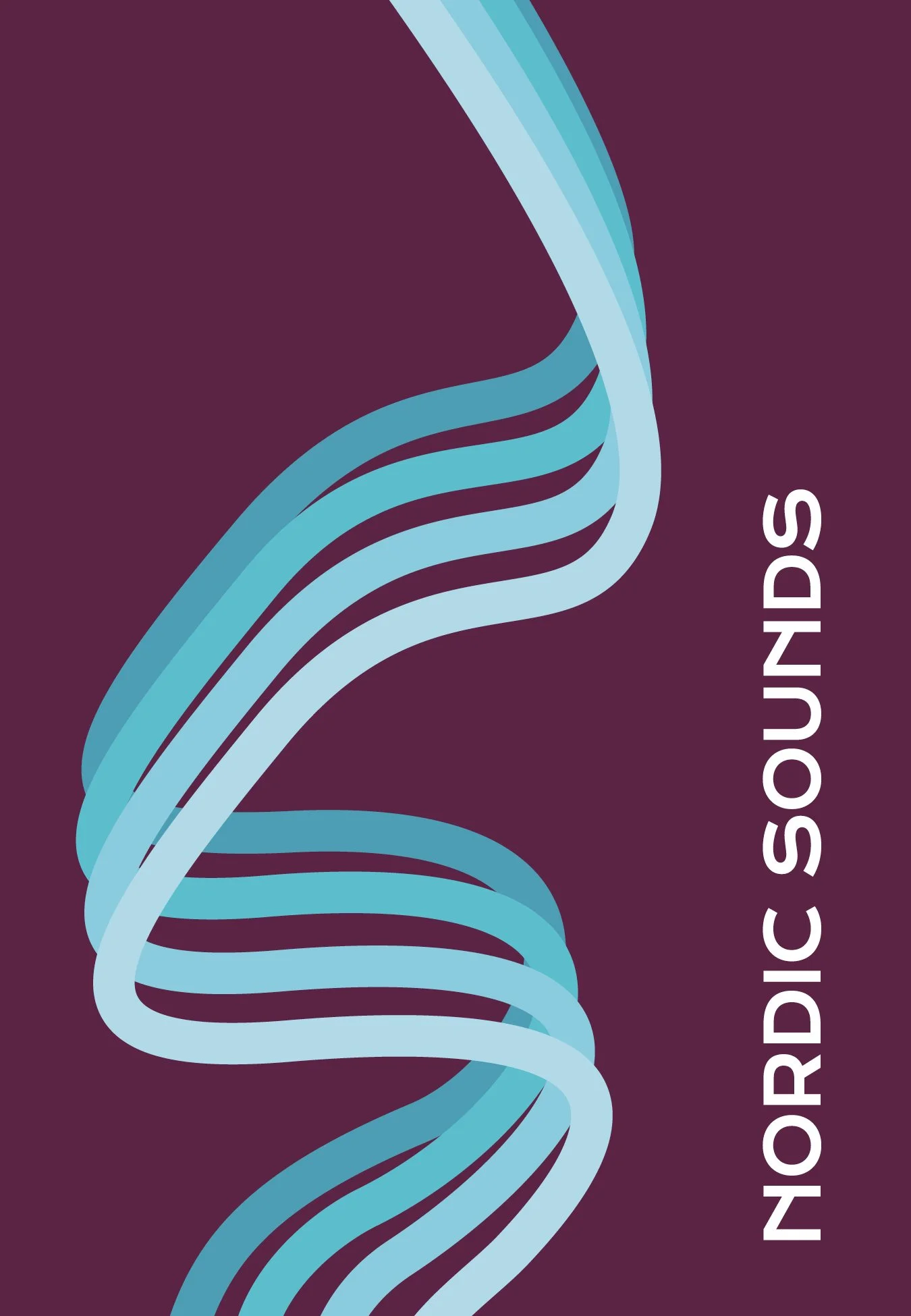
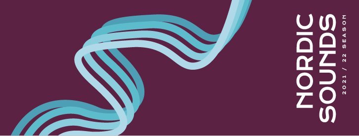
Nordic SoundsMultiple conductors were assembled under the theme of ‘Nordic’ to guide the compositions. Not knowing what all the final pieces would be like, we leaned into the Scandinavian theme and used the lines to reflect an aurora gliding like sound waves across the page.

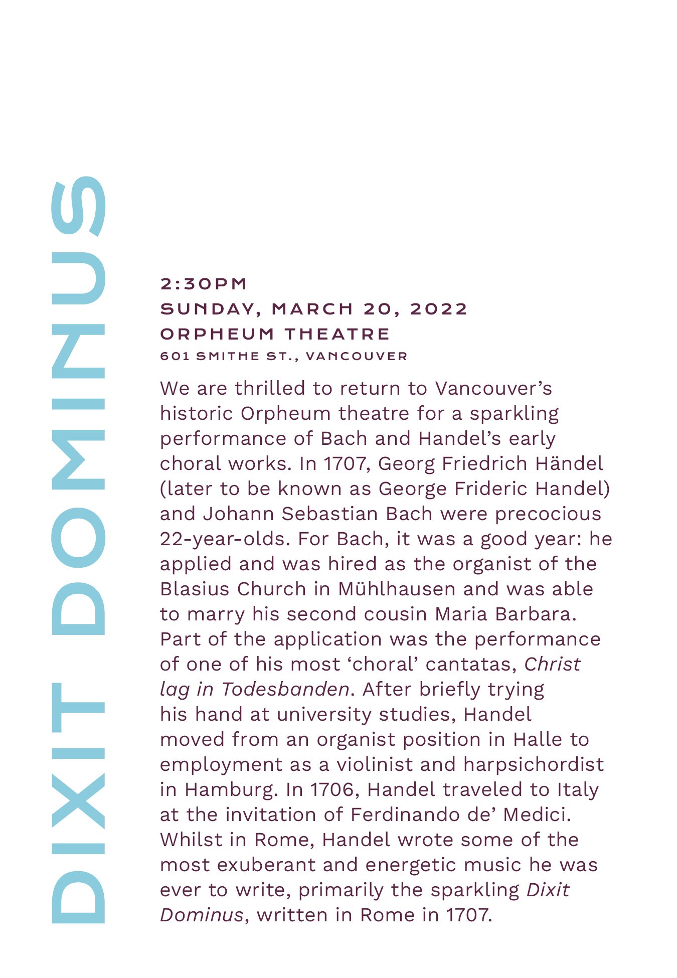

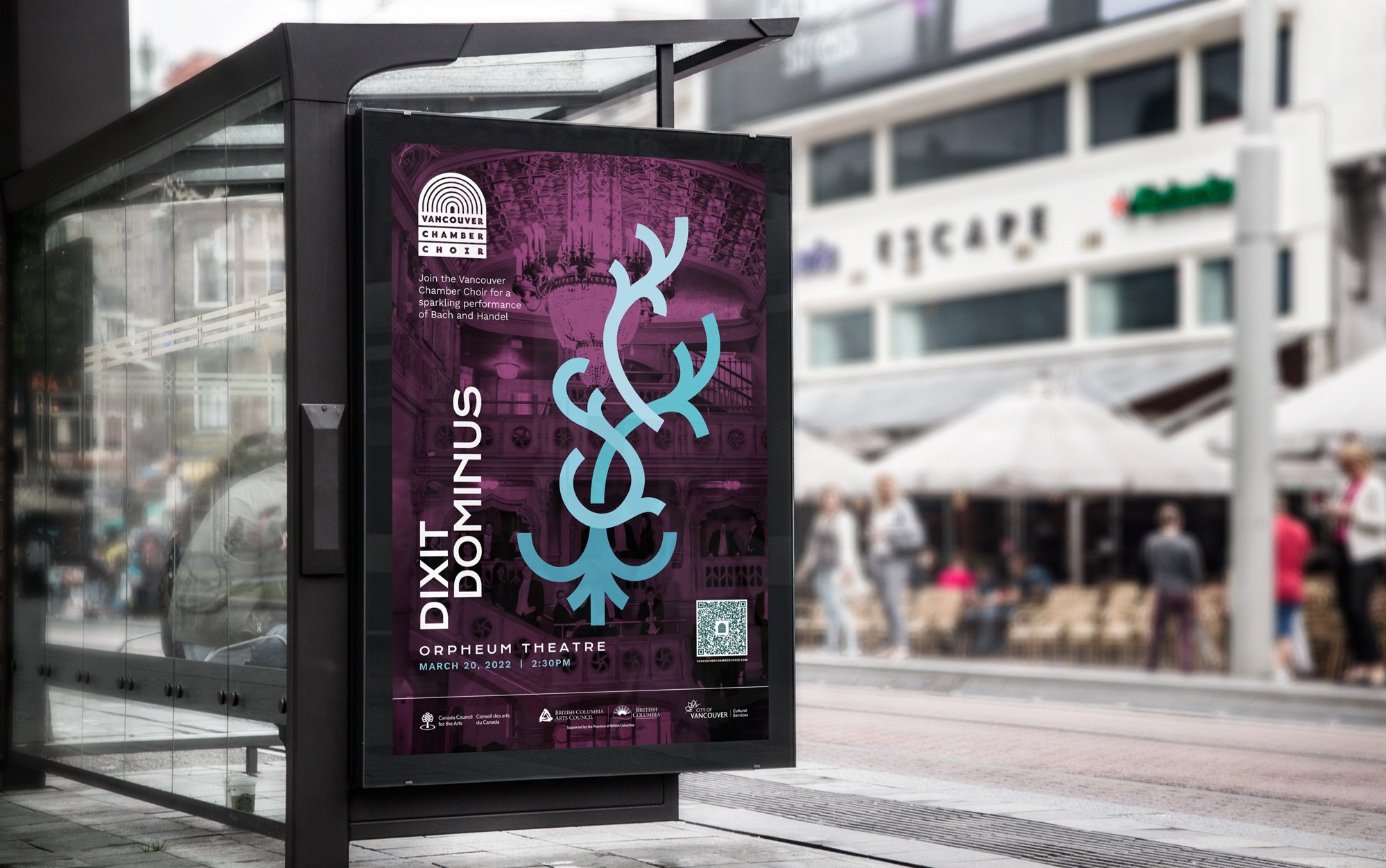
Dixit Dominus was performed at the Orpheum Theatre, a venue that the Vancouver Chamber Choir was proud to be in. We overlayed the concert design on a photo of the Orpheum to showcase the beautiful space and fill the seats. The purple tint was used to unify it with the playbill designs and provide contrast to the graphic and text. We incorporated a QR code for passers-by since COVID brought them into the mainstream.

The worst of the COVID quarantine rules over, this season only needed one animated intro for a recorded performance but I was happy to provide.
2022/2023
While I wasn’t in charge of the most of the designs for the 2022/23 season’s playbills, I still got to animate the couple that needed it! This was a much more dynamic and elegant operation and it was a fun challenge to find the spirit of the piece and design in motion.

Learning Outcomes
It’s rare that I get to work for other artists and it took me a moment to realize I was translating their artful interpretations not their business solutions. It felt more like a collaboration where we were making art together with two mediums. There were of course more practical design solutions like what the brochure and the ads would look like but the rest was a matter of emotion. Once that clicked, I approached the designs more like I would an acrylic canvas, looking for the sweeping motions and impact. This made the next set of playbills that we made for them much more simple to create.